Finding the Weigh
Valuation: Weighing Market Expectations – The Second in a Three-Part Series
- Last month we showed that stock market valuations are currently stretched, demonstrated with the Shiller-CAPE model based on a historical perspective.
- Stocks now appear the most expensive in history when we adjust market valuations for economic growth and earnings potential.
- The single, largest offsetting factor that is currently supporting such high stock prices is the low level of interest rates relative to the earnings yield (Earnings/Price) of the market.
Previously, we evaluated the market’s current and historical valuations. If you recall, the market appears pricey from the metrics provided by Robert Shiller and his Cyclically Adjusted Price/Earnings (CAPE) ratio.
Below, the graph shows more than 130 years of the CAPE ratio. The only times the ratio exceeded today’s high valuations were prior to the crash of 1929 and the during the dot-com bubble, when valuations soared much higher than today’s level. When these types of long-term measures approach their all-time extremes, it’s time for investors to get a plan that goes beyond hoping for higher prices.
Data extracted from dqydj.net, graph created by Altos Investments
IT’S ALL ABOUT PERSPECTIVE
Let’s start this month’s blog by putting some context to the CAPE, one of my preferred valuation tools. To draw insightful conclusions, valuations must be seen relative to the economic environment.
To gain perspective, I will provide a view through a couple of different lenses that suggest wildly different conclusions. If you’re anything like me, you’ll want to hear the bad news first, so we’ll start there, then make our way to the good.
The bad news, in a nutshell, is growth-adjusted valuation. Don’t fall asleep yet! There’s a kernel of wisdom in that snoozer of a word. Simply comparing P/E valuations from one period to another can be likened to mapping the earth onto a flat piece of paper—full of distortions.
In order to make the comparison “apples-to-apples” as much as possible, we must consider a couple of additional factors to adjust for different economic environments. One of the factors to consider is the economic growth trajectory that underpins the relative valuations and sentiment of a given time. In other words, investors will pay up in good times that are likely to get better, but can’t justify paying up in bad times that might get worse. The other important factor is the level of interest rates, which dictate the extent to which the stock market can compete with less risky investments, like U.S. Treasuries.
A METHODICAL WALK ON THE WILD SIDE
We need to add some color to our CAPE. To do so, we want to “growth-adjust” this ratio. If we can expect faster growth rates in the future, we can also justify a higher CAPE, which means paying more for future earnings. When prospects for earnings growth are high, the multiple (P/E) investors are willing to pay tends to be even higher. Let’s dive in.
Corporate earnings are a byproduct of economic activity. As such, growth in the Gross Domestic Product (GDP—our economy’s total output) and growth in earnings tend to be roughly equivalent. While it’s true that earnings growth can vastly differ from economic activity for time measured in years, in the long run, aggregate earnings growth and GDP growth are joined at the hip /move in tandem. For evidence of this relationship, turn to the charts below. The graph on the left plots the three-year average GDP growth rate and its trend since 1950. The trend line helps us understand that growth has been on a steady downtrend during the post-World War II era despite the many ups and downs of the business cycle. The graph on the right shows the close relationship between overall economic growth and corporate profits.
As you can see, GDP growth is roughly equivalent to earnings growth. This observation is the basis for our next step—adjusting CAPE for growth for the entire modern era of investing. If you know where you’ve been, you are more likely to know where you are now.
Data courtesy of St Louis Federal Reserve (NASDAQ: FRED), Bureau of Economic Analysis (BEA), and Bloomberg
Based on the chart that is above and to the left, it is fair to deduce that GDP growth and earnings growth trends are now more anemic than they were in the late 1990s, the last time valuations were this high. The following table highlights some of the key differences between the two periods.
As shown in the 720Global table above, economic growth in the late 1990s was more than double that of today, and the expected trend for growth was also more encouraging. There were plenty of good reasons to be excited in the late 1990s—high growth and productivity, low inflation, and the government actually ran a surplus, which is hard to fathom now. Today’s weak trailing 3-5-10 year annual earnings growth rates stand in sharp contrast with the growth of the roaring 90s. Additionally, government and household debt have ballooned to levels that are now constricting growth and productivity. The assets purchased with all of that debt have not offered much in return, and today’s low-interest rates reflect the current state of economic stagnation. And astonishingly, corporate earnings have barely moved an inch in the last five years, while stocks have posted strong gains over the same time frame.
Now, if we adjust the current market’s prices for the relatively low level of economic output, we clearly see that the market is the most expensive it has EVER been!
HIGH VALUATIONS IN A LOW GROWTH ENVIRONMENT
Looking forward, the standard CAPE level (as shown in the chart at the very top) needs to fall approximately 35% from current levels to reach its long-term, growth-adjusted level based on current GDP growth rates and estimates. Now, I’m not calling for that, but it is always good to know how far that teeter-totter has to fall, when you’re the one at the top.
LOW-INTEREST RATES ARE THIS MARKET’S BEST FRIEND
Now, it’s time for the good news! The earnings-to-price ratio of stocks actually looks attractive relative to bonds.
Looking at low-interest rates, we begin to find justification for stretched valuations. What we see in the graph below is that interest rates are low, when compared to the level of earnings yield that an investor receives in the stock market. This “relative yield” game is important in the battle for capital between asset classes. When investors can earn a decent yield by holding a safe US Treasury bond, why not earn the easy money with very low risk? However, when investors can earn a higher yield in the stock market (based on earnings) with a chance for those earning to grow, why settle for the low yields of Treasuries? This is the key factor that Warren Buffet points to when he says stocks are not expensive.
Data extracted from dqydj.net, graph created by Altos Investments
Beating inflation is the name of the game in investing. As you can see in the chart above, in the 1950s and 1960s, and even in the hyper-inflationary 1970s, investors used to demand more from equity yields (Orange Line) relative to bond yields (Blue Line) due to perceived risk. That relationship has clearly changed since inflation peaked in 1980. Since then, investors typically have gotten more from their bond yields. The thinking was that there was less need for an inflation hedge (stocks), and Treasuries suddenly looked like a sure thing with really attractive, double-digit yields (Treasuries).
However, since the Federal Reserve started to manipulate short- and long-term interest rates through unprecedented measures, the relationship between stocks and bonds has all changed. As such, it appears that in this artificially suppressed interest rate environment, we have temporary, yet solid support for the stock market. If we get a sense that rates may return to more normal levels, then stock valuations would face significant headwinds.
SUMMARY
The equity valuations of 1999, as proven after the fact, were grossly elevated. However, when considered strictly against a backdrop of economic factors, those valuations seem relatively tame versus today’s exorbitantly priced market.
Economic, demographic, and productivity trends all portend stagnation. The amount of debt that needs to be serviced stands at overwhelming levels and puts our economy at risk of rising rates. The first whiff of significant inflation could lead our international creditors to demand higher interest rates. This means that policies that rely on more debt to fuel economic growth are likely to borrow from long-term growth.
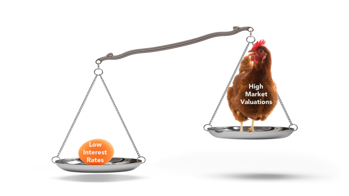
In contrast, policies that gear toward higher labor productivity and not just technological advancement are the answer for long-term economic growth. However, even the most effective policies will take a LOOOONG time before their impact is felt. The one counter-weight in this equation is the pitifully low level of interest rates, which leaves investors craving more risk and more stocks, reaching ever further for return. This condition sets the scale with the low level of interest rates on one side and the reality of expensive valuations on the other.
Next month, we will investigate the outlook for future stock returns from these valuation levels.
Here’s to getting it more right than wrong.
CUTTING THROUGH THE NOISE – A Financial Blog by Will Martin, CFA


